


This is one of those rare moments in time when I try out a new personal art project, and ACTUALLY FINISH IT! (And like it). A few weeks ago I bookmarked a low-poly portrait tutorial that I came across while looking for illustrator/vector tutorials in general.
Since I’ve been in a limbo state due to circumstances with work, I finally decided to try and tackle it during one of my days off. Read on if you care to see my process!
The Process
While deciding on a portrait, I clicked through some of my old FB profile pictures to see what I could find. I eventually came across one that I had photoshopped (quite extensively) with colors and textures a couple years back. I decided that this would be a good test subject for this project.
If you clicked on that tutorial that I bookmarked, you’ll start to realize that I didn’t follow it very closely as we continue with this blog post. Looking at the image above you’ll see I pretty much jumped to Step 7. Since I had already previously processed the photo before, I didn’t see any need to create a new composite to make my base photo more “interesting”. I was also too lazy to get out my tablet to make preliminary line sketches just to have to draw the lines again with the pen tool. Like most tutorials, I tend to just use them as a reference, instead of following them to a T.
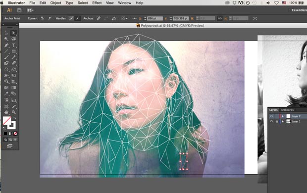
Anyway, for the next couple of hours I sat at the computer just creating random triangles where I think it should form in the photo. For the most part I just followed my gut when I did this (even the tutorial says to do this). I tried to be conscious of when the triangles converged that they didn’t create an unwanted depth or focus point where I didn’t want it. I also tried to not use too many small triangles, since I wanted to keep the portrait as simple as possible. I was also getting sick of drawing so many damn triangles. Lol

Once all those triangles were drawn, now came the easier part: filling them in! I basically was switching between the hot keys “i” and “v” to use the eyedropper and select tool. Sometimes I had to backtrack and redo the color if it just did not mesh well with the triangle’s surroundings. This step probably took about half the time or less than drawing the damn triangles.
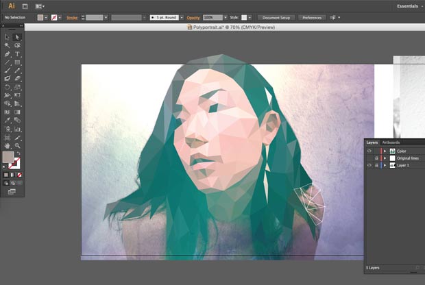
Nearing the end of coloring I wasn’t sure where I should exactly stop. I really REALLY did not want my head to be some floating Medusa/Demon head like in this JonTron game review (if you watch, you’ll understand), but at that point I didn’t really like my shoulders being in there since I think it was an awkward pose, and I was getting pretty tired. So I ended up taking in out, and coming up with this first draft by the end of the night:
I wasn’t completely satisfied with it when I went to bed. I was thinking about posting it to my Instagram but I just didn’t like it. The more I looked at it on my tiny phone screen, the more things I realized I wanted to change… but was too tired that night to fix.
So I went to bed.
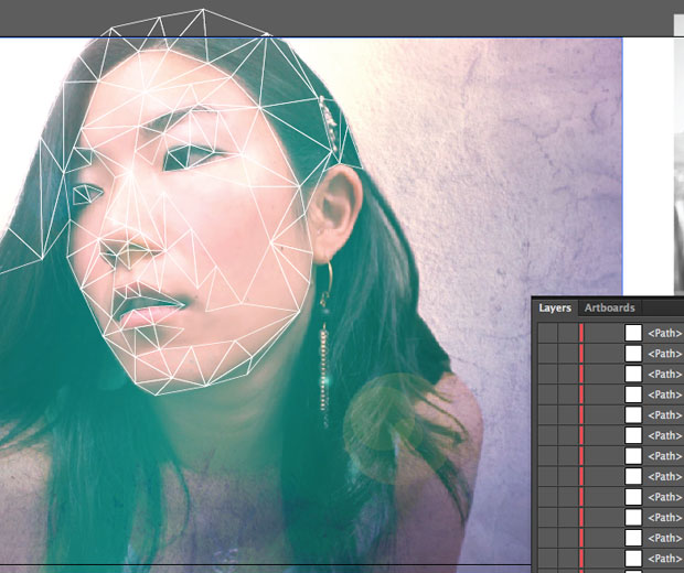
The next morning I woke up rearing to go. The first thing that I really wanted to change were the eyes. The way that I had first done them, they looked too flat and kind of boxy. If you look back at the tutorial that I was following, this guy did not have any eyes in his since he had sunglasses on instead. Therefore, I had nothing to reference from there. I ended up googling “low poly portrait” to see what came up in the image results so that I could observe how others handled their eyes. The approach I ended up using didn’t change them drastically, but just enough so that it would look less “cold” to me.
The next thing that I did was start to add back in my shoulders. (Thankfully I had only hidden the layers instead of deleting them). I still wasn’t very happy with having both of them in, so I decided to see what it would look like to take out the left side. I realized that the low poly portraits that stood out to me in my google image searches were the ones that were at a 3/4 view, and asymmetrical. In my case, my head was definitely facing at a 3/4 turn, but my shoulders made everything look way too symmetrical and boxy. To me, it didn’t flow right. After I took out the shoulder, I started adding more hair on the left side. *Yippee, more triangles* I decided to stop and take a look again.
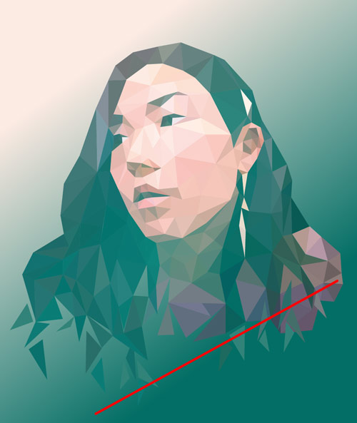
I realized taking out the shoulder did help, but overall the image looked too equal on the bottom. I was still not satisfied with it. Then, I realized I had to drastically add more hair, according to that red line to get the shape that I was itching towards. I then set out to create, alas, more triangles.
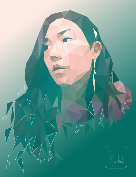
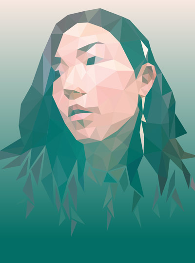
And… TADA! I made it to the end! One last thing that I wanted to add from my google image research were extra triangle fractals and some white lines. The placement of them was a little difficult for me to determine, but I figured out something I liked.
Seeing the two stopping points that I had it, I’m so happy that I kept going until the end. I’m glad that I didn’t allow my laziness to overpower making this portrait just right. Admittedly, I was about to give up back when I drew in that red line when I realized how much I still had left. Instead I powered through creating those damn triangles and got to the end result that I wanted and am very proud of.
So there you have it. I hope the slight insight into my process will help you on your process to make your low-poly portrait.
