Now that I finally got this “read more” thing working, I’m going to implement it for this long.. LONG post.
You have been warned…
Teehee
So anyways, the next project for Digital Letterform is to create our own typeface.
To get this started I had to look around at some examples to spark some ideas.
Click “read more” to see what I found.
For my research I sat in the AAA library to look through two design magazines.
One called Novum and the other Eye
I came across a lot of interesting and inspirational artists and their work, so here’s one of what I found:
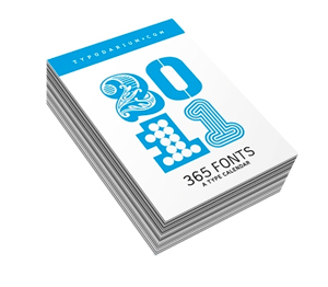
Lars Harmsen & Raban Ruddigkeit have created a day by day calendar with different typefaces for each day. This is pretty cool, and a great starting point, I think. Not really sure if I’ll ever get my hands on one of these, but it was great to come across while doing research.
======
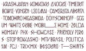
Pedro Inoue
I actually saw one of his things in one of the magazines, but I couldn’t find it on his website.
But when I looked through his work, I realized that I really enjoy his style.
Especially his Krash Japan spreads:
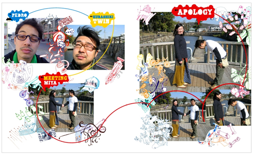
It implements both type and illustrations which is interesting to me. I might try to use it sometime.
Anyways, as far as fonts go with him, he has a few that are really cool like his Jamie Cullen stuff:
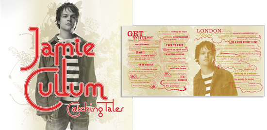
I’m not sure if it’s the typeface itself that makes me really interested, but I do like how he’s using them to help with the imagery of his work.
======
Stefanie Schwarz is a graphic designer. I came across her Polymorph in the Novum magazine. She basically got the inspiration for each letter from different languages around the world.The idea is that everything can be linked back to latin roots.
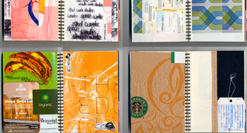
I also looked at her other things and came across a few pictures of her sketch books filled with all sorts of graphic materials.. like tags, cars, bags.. magazine clippings.. I should really keep a journal like that… I was for a little bit, but mostly because it was for a class >.<
Ahh… artists are making me rethink my lifestyle xD
======

Brandever does a lot of work with wine companies to help with branding and such. The design that I saw in Novum was this one above. There was a lot of intricate line shapes in this that I found lovely, and I think all it really takes.. I think, is a good image and then some clipping masks.
=====

Prologue is a film company.I’m not positive who did the design for this typeface, but I liked it a lot. The line work is very clean and easy to read.
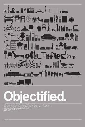
This movie poster was designed by the design company known as Build.
If you look closely at the images, you can see the word “Objectified” too. I kinda like the idea of using images to create text… and my next few research posts will start to lead to that…
=====
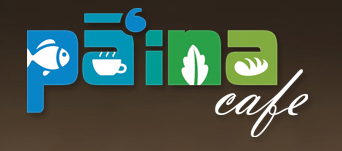
I’m actually not sure who designed this either, BUT, when I ate there this past spring break, their logo/sign was one of the first things I noticed (besides the ono lookin’ poke) Still uses images within the text to become a part of it. Simple and clever… and cute. Haha
=====
Ariane Spanier is another graphic designer that I learned about when I came across this image:
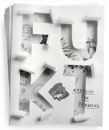
A lot of their work utilizes text a lot.
I’m not sure what else to say, but check out their website! It’s crazy… lol
=====
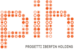
Boutique Creativa, is another design company who designed the logo for Progetti Iberfin Holding
It’s basically small icons/images that are in a grid format that are combined to create the letter.
=====
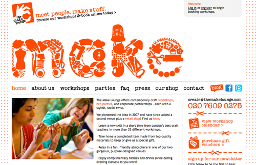
Design Friendship is another design company. The thing that caught my was their typeface that they created for The Make Lounge.
So many little images put together to make the letters. I love how the letters are so clear and legible, and that everything within the letters relates to things that “make”.
If you go to other pages on their site, like the “About” page, they change up what’s inside to thought bubbles. And the same thing happens when you go to the “FAQ” page.
I think that for my project I’m going to pursue an idea that is related to this, that’s for sure.
I’m not sure what my subject matter is going to be when I do make it though…
Someone suggested that I pick things that start with the letter to put inside.
i.e. A will have alligators, airplanes and apples.
I’ll keep sketching though!
